Thursday, May 24, 2012
Wednesday, May 23, 2012
Tuesday, May 22, 2012
Friday, May 18, 2012
Thursday, May 17, 2012
Tuesday, May 15, 2012
Monday, May 14, 2012
Friday, May 11, 2012
Friday, April 27, 2012
Thursday, April 26, 2012
Monday, April 23, 2012
Walk cycle
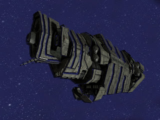
This Project wasn't really that hard once I figured out what to draw for the walk cycle, after that, it was just following the template and putting it into photoshop. I think I created a very original walk cycle. It's not often that you see a steampunk robot that walks like a sir.
Monday, April 16, 2012
Evil Duck
This duck was traced using Illustrator, and for having no experience at all with the program, I think I did pretty well on it.
I decided to make the eyes demonic just to add my own sense of humor into the picture. The entire picture was colored using some sort of gradient or other.
Friday, April 13, 2012
tutorial
http://www.youtube.com/watch?v=W4OlkHjqrqk
This is the link to the tutorial that I used to make this banner.
The tutorial shows some basics to really help you jump-start into using Illustrator and is really easy to follow.
This is the link to the tutorial that I used to make this banner.
The tutorial shows some basics to really help you jump-start into using Illustrator and is really easy to follow.
Wednesday, March 21, 2012
Thursday, March 15, 2012
PeakFest Poster
This project was definitely one of the easiest I've ever done. The only hard part about it was finding a good enough background image to use for the poster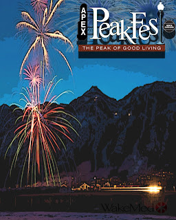 , after that, a small amount of touching up and adding some effects to make it look better. I can easily say that it turned out well, I honestly don't expect it to be chosen by Apex to use for PeakFest, though I still think I did a fairly good job putting it together.
 , after that, a small amount of touching up and adding some effects to make it look better. I can easily say that it turned out well, I honestly don't expect it to be chosen by Apex to use for PeakFest, though I still think I did a fairly good job putting it together.
Tuesday, March 13, 2012
Death Word Art
Although this project was fairly simple, it was very time consuming and VERY tedious. Every square inch of the picture is made from the one word, DEATH.
I would have to say that the hardest part of this project was choosing a picture to use, and were I to do this again, I would most likely choose a simpler picture.
This project taught me how to use the text tool in photoshop to its fullest extent.
Monday, March 12, 2012
Transformers stopmotion
http://www.youtube.com/watch?feature=endscreen&NR=1&v=Zng3Vx9UeXI
^^^^^^^^^^^^^^^^^^^^^^^^^^^^
Click the link to watch
^^^^^^^^^^^^^^^^^^^^^^^^^^^^
Click the link to watch
Megaman stopmotion
<a href="http://www.youtube.com/watch?v=AtUDOGPrnyk"></a>
^^^^^^^^^^^^^^^^^^
Click the link to watch.
^^^^^^^^^^^^^^^^^^
Click the link to watch.
Thursday, February 16, 2012
The Magic of Retouching
 This was an easy project, and a very successful one. Once I learned how to use each of the retouching tools, it wasn't hard at all to spot and eleminate all of the "Imperfections" of each picture. The only difficult part was retouching the girls enough to make them appear "Perfect" without overdoing it.
 Through this project, I learned how to use various new tools and how to effectively spot any imperfection in a photo and to tell whether or not a photo has been photoshopped.
Monday, February 13, 2012
(Paint Splat) Nightmare
This project was easily the most difficult project that I've completed this semester, especially since we didn't have any guidelines to go off of. I would have to say that using the very narrow selection of paint splats that were offered to me to complete this and make it look good was the most difficult part of this.
Though once I found an appropriate picture that I could use with the paint splats given to me, it became a relatively simple task, resulting in what you see here.
Though once I found an appropriate picture that I could use with the paint splats given to me, it became a relatively simple task, resulting in what you see here.
Color Wheel
This was a difficult project, though I'm confident that it turned out well. Getting the colors of my wheel to coincide properly with an actual RGB wheel was the most difficult part of this project, though once I got that gonig, it was simple enough to color each item and paste it in the proper location.
Through this project, I learned how to group several layers into a folder, making it much easier to navigate through them and modify all of them at once.
Monday, February 6, 2012
Universe
Although this project was fairly successful, I feel I could have done a lot better had I put more time into it. I feel as though I didn't put in enough effects to actually make it look space-like. Making the planets actually look realistic was one of the most difficult parts of this project, and if I were to do this again, I would be sure to use several more special effects to make it look much better.
From this project, I discovered the use of special effects such as Lens Flare among other effects.
Color-Nightmare
I felt this to be a very easy, therefore a very successful project. After I messed around with the dancer image for a while, I decided to switch to something that I liked a bit more, ergo, I used Nightmare. Overlaying the colors was easy as pie, though I did still make mistakes and had to correct them, but after that, the only "difficult" part was making it look good, making the colors transition smoothly.
From this project, I learned how to use threshold to make a picture black and white and then to overlay colors onto that picture, like you see above.
From this project, I learned how to use threshold to make a picture black and white and then to overlay colors onto that picture, like you see above.
Thursday, February 2, 2012
Cobra-Falcon
This was easily the most difficult project I've done thus far. Though through creativity and improvisation, it turned out to be a successful peice. Making the snake mouth look like it belonged to the falcon was excruciatingly difficult, considering that several tools simply didn't work, forcing me to take a different route to achieve the same goal. The only thing I would do were I to do this over, would be to use a different combination of animals, and possibly use more than two.
Through this project, I learned how I can use many different tools to have the same end effect, if used correctly.
Just to give you a comparison, I posted the original falcon picture
Water Dragon
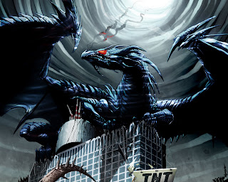 This peice was very successful. Adding the textures to the dragon was fairly simple, though time consuming; definately the hardest part of the project, considering it was the only part of the project... Though if I were to redo this project, I would use a different texture instead of water, and probably a different picture, since the water texture didn't show up very much in this one.
From this project, I learned how to warp a picture, and then overlay it over another picture to make it look like it is part of the image.
Friday, January 27, 2012
Clones
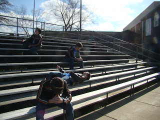 This was definately a successful peice. It came together like an oiled clock. Easily the simplest peice I've worked on in Photoshop so far. The only way I can see to make it better would be to add more clones. MORE CLONES! ATTACK! Not really... You guys can just sit there...Chillin...
Through this project, I learned how to make several layers look like a single layer.
Frog Tongue
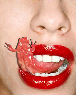 I believe this was a very successful piece. Though at first I tried to use a dragon, it ended up not looking realistic at all, so I went with a simple frog. After that, I already knew exactly how to make it work, so it came together fairly easily. The most difficult part had to have been using the clone-stamp tool to make the frog look like the tongue. If I were to redo this project, I would take a little more time in making the frog match the tongue exactly.
Through this project I learned how to use the clone-stamp tool, now one of my most-used tools in Photoshop.
Angry Pancake
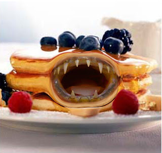 I feel this was a fairly successful project, especially considering it was my first ever time using Photoshop. I do feel I could do better were I to try again, however. I think the hardest part of this project was stretching and liquifying the pancakes for the mouth to fit properly. I would definately take more time to make the effects look neater and more realistic if I redid this project.
 Through this project, I learned many of the basic tools of photoshop, and a basic understanding of the navigation menu.
Subscribe to:
Posts (Atom)


